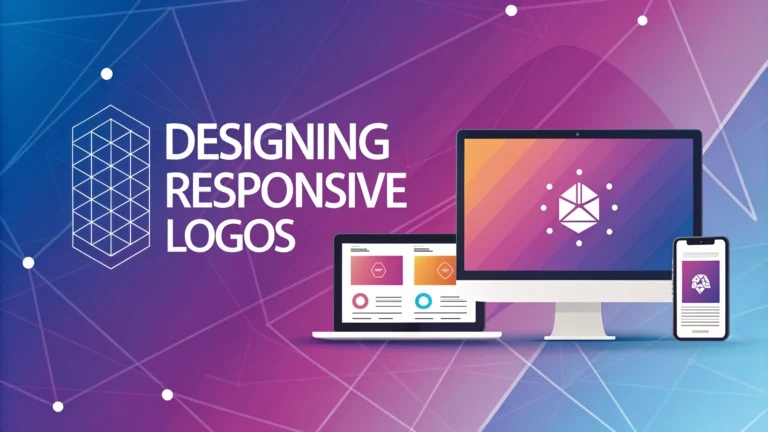
Responsive logos adapt seamlessly across different screen sizes and devices while maintaining brand recognition.
What Makes a Logo Responsive
A responsive logo system includes multiple variations of your logo, each optimized for specific contexts and sizes.
- Primary logo (full version with all elements)
- Secondary logo (simplified version)
- Symbol/icon (most minimal version)
- Favicon (16×16 pixels for browser tabs)
Design Principles for Responsive Logos
Start with the most complex version and gradually simplify while maintaining brand identity.
- Remove detailed elements at smaller sizes
- Adjust spacing between elements
- Modify typography for better readability
- Consider horizontal and vertical arrangements
Technical Requirements
Export logos in multiple formats to ensure quality across platforms.
- SVG for scalable web use
- PNG for transparency needs
- JPG for simple applications
- AI/EPS for print materials
Size-Specific Considerations
| Size | Recommendation |
|---|---|
| Desktop | Full logo with all elements |
| Tablet | Simplified version with core elements |
| Mobile | Icon or symbol only |
| Favicon | Most minimal version |
Testing Your Responsive Logo
Test your logo across different devices and contexts before finalizing the design.
- Check visibility at different sizes
- Test on dark and light backgrounds
- Verify loading speed on mobile devices
- Review in various browsers
Common Mistakes to Avoid
- Adding too many details in smaller versions
- Ignoring spacing requirements
- Using raster formats for scaling
- Compromising brand recognition in simplified versions
Tools for Creating Responsive Logos
- Adobe Illustrator (https://www.adobe.com/products/illustrator.html)
- Sketch (https://www.sketch.com)
- Figma (https://www.figma.com)
- Affinity Designer (https://affinity.serif.com/designer)
File Organization Tips
Maintain a clear folder structure for different logo versions and formats.
/logo
/web
/svg
/png
/print
/eps
/pdf
/social
/profile-images
/headers
Document usage guidelines for each logo variation to ensure consistent implementation across your brand.
Implementation Best Practices
Follow these guidelines to ensure optimal logo display across platforms.
- Use CSS media queries to swap logo versions
- Implement lazy loading for larger logo files
- Maintain consistent padding around logos
- Set up proper fallbacks for various browsers
Performance Optimization
File Size Management
- Compress SVG files using SVGO
- Optimize PNG files for web use
- Use appropriate resolution for different devices
- Consider using WebP format where supported
Accessibility Considerations
Ensure your responsive logo system meets accessibility standards.
- Include proper alt text for all logo versions
- Maintain sufficient color contrast
- Ensure logos are recognizable for colorblind users
- Test with screen readers
Future-Proofing Your Logo System
- Plan for emerging device formats
- Document logo usage guidelines thoroughly
- Create vector-based master files
- Store original design files securely
Conclusion
A well-designed responsive logo system is essential for maintaining brand consistency across digital platforms. Success requires careful planning, thorough testing, and attention to technical details. Regular reviews and updates ensure your logo system remains effective as technology evolves and new devices emerge.
Remember to document all logo variations and maintain clear usage guidelines to ensure consistent implementation across your organization. With proper planning and execution, your responsive logo will effectively represent your brand across all digital touchpoints.
FAQs
- What is a responsive logo design?
A responsive logo design is a logo that adapts and changes based on the screen size and device it’s being viewed on, maintaining its legibility and impact across all platforms while preserving brand recognition. - What are the key elements of a responsive logo?
The key elements include a scalable vector format, simplified versions for smaller sizes, consistent brand elements, maintained proportions, and variations in complexity that work at different dimensions. - How many versions of a responsive logo should I create?
Typically, you should create 3-4 versions of your logo: the full version, a simplified version, an icon-only version, and sometimes a horizontal or stacked alternative for different aspect ratios. - What file formats are best for responsive logos?
SVG (Scalable Vector Graphics) is the primary format for responsive logos, as it maintains quality at any size. Additional formats like PNG and JPEG should be exported at various sizes as fallbacks. - How do I ensure my logo remains legible at smaller sizes?
Remove fine details, increase spacing between elements, thicken thin lines, and simplify complex shapes when scaling down. Text may need to be enlarged or removed entirely at smaller sizes. - What’s the minimum size a responsive logo should be legible at?
A responsive logo should be legible down to 16×16 pixels for favicon use, though the simplified version might be used at this size rather than the full logo. - Should my responsive logo use different colors for different sizes?
While the core brand colors should remain consistent, you might need to eliminate gradients or simplify color schemes for smaller versions to maintain clarity and impact. - How do I test my responsive logo design?
Test your logo across multiple devices, platforms, and applications. Use browser testing tools to check various screen sizes and ensure it works in both light and dark environments. - What’s the difference between responsive and adaptive logos?
Responsive logos fluidly scale and adapt to different sizes, while adaptive logos have specific fixed variations for predetermined breakpoints or use cases. - How do I implement responsive logos on a website?
Use SVG files with CSS media queries to swap between logo variations at different breakpoints, or implement picture elements with different sources for various screen sizes.


