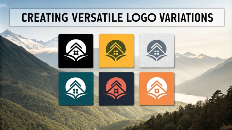
Logo variations allow your brand identity to adapt across different platforms, contexts, and applications while maintaining visual consistency.
Types of Logo Variations
- Primary Logo – Your main, full-color version
- Horizontal Layout – Elongated version for headers
- Vertical/Stacked Layout – Compact version for square spaces
- Icon/Symbol Only – For social media profiles and favicons
- Wordmark Only – Text-based version without symbol
- Monochrome – Single color version
- Reversed/Inverted – Light version for dark backgrounds
Essential Logo Formats
- Vector (.ai, .eps, .svg) – For scalable, print-ready files
- Raster (.png, .jpg) – For digital applications
- Different sizes – From favicon (16x16px) to large format prints
Quick Tips for Logo Variation Design
- Test each variation at different sizes to ensure legibility
- Create versions that work in both color and black/white
- Maintain consistent proportions across variations
- Design responsive versions for different aspect ratios
- Include spacing guidelines for each variation
Common Applications
| Platform | Recommended Variation |
|---|---|
| Website Header | Horizontal Layout |
| Social Media Profile | Icon/Symbol Only |
| Business Cards | Primary Logo |
| Mobile App | Simplified Icon |
File Organization Tips
Organize your logo files in a clear folder structure with subfolders for different formats and uses.
Logo_Package/
├── Vector/
│  ├── Primary/
│  ├── Horizontal/
│  └── Icon/
├── Web/
│  ├── High_Res/
│  └── Social_Media/
└── Print/
├── CMYK/
└── Pantone/
Technical Specifications
- Web: RGB color mode, 72 DPI
- Print: CMYK color mode, 300 DPI
- Social Media: Square format, multiple sizes
- Vector: Scalable, editable artwork
Store your logo package in cloud storage and create a style guide documenting usage rules for each variation.
Usage Guidelines
- Set minimum size requirements for each variation
- Define clear space rules around the logo
- Specify allowed and prohibited color combinations
- Document placement restrictions
Contact a professional designer through platforms like Behance or Dribbble for expert logo variation creation.
Best Practices for Implementation
- Create a brand kit with all logo variations and guidelines
- Provide stakeholders with access to approved logo files
- Regularly audit logo usage across platforms
- Update variations as brand evolves
- Document any special usage scenarios
Quality Control Checklist
- Verify color accuracy across all formats
- Test legibility at various sizes
- Check file compatibility with common software
- Confirm proper rendering on different devices
- Validate spacing and proportion consistency
Common Mistakes to Avoid
- Stretching or distorting logo proportions
- Using low-resolution files for print
- Applying incorrect color variations
- Neglecting clear space requirements
- Missing essential format variations
Maintenance and Updates
Regular Review Points
- Annual brand identity audit
- Platform requirement changes
- New digital format needs
- Brand evolution adjustments
Conclusion
A comprehensive logo variation system ensures brand consistency across all touchpoints while maintaining flexibility for different applications. Regular maintenance, proper organization, and strict adherence to guidelines help preserve brand integrity across all platforms and media types.
Remember to document all variations in your brand guidelines and keep master files secure with appropriate backup systems. Stay current with platform requirements and industry standards to ensure your logo variation system remains effective and relevant.
FAQs
- What are the essential logo variations every brand should have?
Every brand should have a primary logo, a simplified version, a monochrome version, a reversed/inverted version, a favicon, and social media profile versions to ensure versatility across all applications. - Why do I need different versions of my logo?
Different versions are necessary to maintain brand consistency across various platforms, backgrounds, sizes, and printing methods while ensuring optimal visibility and recognition in all contexts. - What’s the difference between vertical and horizontal logo variations?
Vertical (stacked) logos arrange elements top-to-bottom, ideal for square spaces, while horizontal logos arrange elements side-by-side, better suited for website headers and wider applications. - How do I ensure my logo is legible at different sizes?
Create scalable versions with simplified details for smaller sizes, maintain proper spacing between elements, and test the logo at various dimensions to ensure readability. - What file formats should I include in my logo package?
Essential formats include vector files (AI, EPS, SVG), raster files (PNG, JPG), and PDF versions. Include both CMYK versions for print and RGB for digital use. - Should I create a responsive logo system?
Yes, responsive logos adapt to different screen sizes and contexts by progressively simplifying elements while maintaining brand recognition, making them essential for modern digital applications. - What’s the importance of a monochrome version?
Monochrome versions ensure your logo works in single-color applications, such as faxes, embroidery, stamps, watermarks, and when color printing isn’t available. - How do I maintain consistent spacing in logo variations?
Establish clear exclusion zones using a measurement unit from the logo itself (like the height of a letter) and maintain this proportion across all variations. - What’s the purpose of having a reverse logo version?
Reverse logos (white or light versions) are necessary for dark backgrounds, ensuring visibility and maintaining brand consistency across different colored surfaces and applications. - How many color variations should my logo have?
A complete logo package should include the primary brand colors, monochrome (black and white), grayscale versions, and any approved secondary color variations defined in the brand guidelines.


