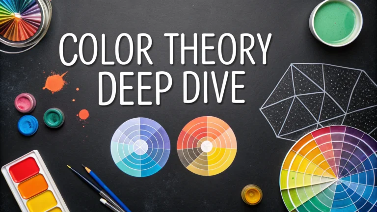
Color theory forms the foundation of effective logo design, helping create visually appealing and memorable brand identities.
Primary Colors in Logo Design
Red, blue, and yellow serve as the building blocks for all other colors, each carrying distinct psychological impacts:
- Red: Energy, passion, urgency
- Blue: Trust, stability, professionalism
- Yellow: Optimism, clarity, warmth
Color Harmony Techniques
Understanding these basic color relationships helps create balanced logo designs:
- Complementary: Colors opposite on the wheel (blue/orange)
- Analogous: Colors next to each other (yellow/orange/red)
- Triadic: Three colors equally spaced on the wheel
Color Psychology for Brands
| Color | Industry Applications |
|---|---|
| Green | Eco-friendly, health, finance |
| Purple | Luxury, creativity, spirituality |
| Orange | Food, entertainment, youth |
Practical Tips for Color Selection
- Test logo designs in both color and black/white
- Consider color blindness accessibility
- Limit your palette to 2-3 colors maximum
- Check color meaning across different cultures
Technical Considerations
Always specify colors using both RGB (digital) and CMYK (print) values for consistency across mediums.
Save color codes using these formats:
- HEX: #000000
- RGB: rgb(0,0,0)
- CMYK: 0,0,0,100
Common Color Mistakes to Avoid
- Using too many colors in one design
- Picking trendy colors over brand-appropriate ones
- Ignoring contrast requirements
- Not testing colors across different backgrounds
For professional color consulting, contact the Color Marketing Group at colormarketing.org.
Advanced Color Applications
Beyond basic color theory, successful logo design requires understanding advanced color applications and their impact on brand perception.
Gradient Usage
- Subtle gradients add depth and dimension
- Modern logos often use dual-tone gradients
- Ensure gradient compatibility across platforms
Digital Adaptation
Modern logos must function effectively across various digital platforms:
- Social media profile pictures
- Mobile app icons
- Website favicons
- Email signatures
Color Trends and Longevity
While trends influence design choices, successful logos balance current preferences with timeless appeal:
| Year | Trending Colors |
|---|---|
| 2023 | Muted pastels, earth tones |
| 2024 | Digital violet, sage green |
Conclusion
Effective color selection in logo design requires balancing multiple factors:
- Brand personality and industry standards
- Technical requirements across media
- Cultural significance and accessibility
- Long-term viability and recognition
Remember that color choices should support brand identity while ensuring practical functionality across all applications. Regular review and subtle updates can help maintain relevance while preserving brand recognition.
FAQs
- What is color theory and why is it essential for logo design?
Color theory is the scientific study of color relationships and how they influence human perception. In logo design, it helps create visual harmony, evoke specific emotions, and ensure brand recognition through strategic color choices. - Which color combinations work best for corporate logos?
Blue and white combinations often work well for corporate logos as they convey trust and professionalism. Other effective combinations include navy with gold, gray with blue, or monochromatic variations of a single corporate color. - How does the psychology of colors affect logo design?
Colors trigger psychological responses: red evokes excitement and urgency, blue suggests trust and reliability, yellow represents optimism and clarity, green signifies growth and nature, and purple conveys luxury and creativity. - What is the importance of color contrast in logo design?
Color contrast ensures logo visibility and readability across different mediums. High contrast between elements helps the logo remain distinct and legible when scaled down or viewed from a distance. - How many colors should be used in a logo design?
Most effective logos use 1-3 colors. Using too many colors can increase printing costs, complicate reproduction, and potentially confuse the brand message. Some iconic logos, like McDonald’s or Google, are exceptions to this rule. - What is color harmony and how does it apply to logo design?
Color harmony refers to the pleasing arrangement of colors using schemes like complementary, analogous, or triadic combinations. It creates visual balance and ensures the logo elements work together cohesively. - How do different color spaces (RGB vs. CMYK) affect logo design?
RGB is for digital display (web, screen), while CMYK is for print materials. Logos must be designed with both color spaces in mind to maintain consistency across all applications. - What role does color value play in logo design?
Color value (lightness or darkness of colors) affects logo visibility and hierarchy. Proper value contrast ensures the logo remains effective in both color and monochrome versions. - How should seasonal color trends be approached in logo design?
While it’s important to be aware of trends, logos should prioritize timelessness over trending colors. A well-designed logo should remain effective and relevant for many years. - What are color accessibility considerations in logo design?
Logo colors must be chosen with color-blind individuals in mind. Ensuring sufficient contrast and avoiding problematic color combinations (like red and green) makes the logo more accessible to all viewers.


