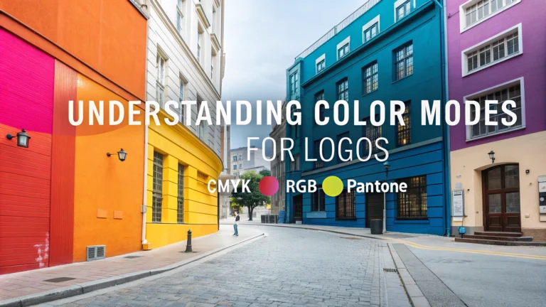
Choosing the right color mode is essential for creating logos that look perfect across all applications.
RGB (Red, Green, Blue) color mode works best for digital displays, websites, and social media platforms.
CMYK (Cyan, Magenta, Yellow, Key/Black) is the standard for printed materials like business cards, brochures, and signage.
Color Mode Quick Guide:
- RGB: Digital applications
- Websites
- Mobile apps
- Email signatures
- Social media profiles
- CMYK: Print materials
- Business cards
- Letterheads
- Banners
- Product packaging
Best Practices for Logo Color Management:
- Create your logo in vector format using software like Adobe Illustrator
- Save separate versions for RGB and CMYK use
- Test print your CMYK logo before mass production
- Keep color codes documented for consistent reproduction
Converting between RGB and CMYK can cause color shifts, so design with both formats in mind from the start.
Recommended Color Values for Brand Consistency:
| Format | What to Save |
|---|---|
| RGB | Hex codes (#FFFFFF) RGB values (255, 255, 255) |
| CMYK | CMYK percentages (C:0 M:0 Y:0 K:0) Pantone colors (if applicable) |
For web-only businesses, focusing on RGB color mode is sufficient.
Companies requiring printed materials should prioritize CMYK during the design process.
File Format Recommendations:
- Vector files: .ai, .eps, .svg
- RGB files: .png, .jpg
- CMYK files: .pdf, .tiff
Always request both RGB and CMYK versions from your logo designer for maximum flexibility.
Store your logo files in a cloud service or shared drive for easy access by team members and vendors.
Consider working with a professional printer who can guide you through color matching and production requirements.
Additional Considerations for Color Management
Color Psychology in Logo Design:
- Red: Energy, passion, urgency
- Blue: Trust, stability, professionalism
- Green: Growth, nature, health
- Yellow: Optimism, clarity, warmth
- Purple: Luxury, creativity, wisdom
Consider your industry standards and target audience when selecting logo colors.
Special Color Situations:
- Metallic finishes require special Pantone colors
- Embroidery may need simplified color schemes
- Vehicle wraps might need adjustments for large-format printing
- Digital signage may require brightness adjustments
Logo Variations to Prepare:
| Version | Purpose |
|---|---|
| Full Color | Primary usage for both RGB and CMYK |
| One Color | Simplified printing, embroidery |
| Reversed | White version for dark backgrounds |
Conclusion
Successful logo implementation requires careful attention to color modes and file formats.
Maintain both RGB and CMYK versions to ensure consistent branding across all platforms.
Final Checklist:
- Create master vector files
- Save in multiple color modes
- Document all color values
- Test in various applications
- Establish clear usage guidelines
- Keep backups of all versions
Regular review and updates of logo files help maintain brand consistency as technology and printing methods evolve.
FAQs
- What’s the difference between RGB and CMYK color modes for logos?
RGB (Red, Green, Blue) is for digital displays like websites and screens, while CMYK (Cyan, Magenta, Yellow, Black) is for printed materials. Logos need both versions for different applications. - Why do my logo colors look different when printed than on screen?
This happens because RGB has a wider color gamut than CMYK. Colors that look vibrant on screen may appear duller in print because CMYK cannot reproduce certain RGB colors. - Should I design my logo in RGB or CMYK first?
Design in CMYK first if your primary logo use will be print materials. This ensures your colors will be accurate in print and can be converted to RGB for digital use later. - What are Pantone colors and why are they important for logos?
Pantone colors are standardized color matching system that ensures consistent color reproduction across different mediums and manufacturers, crucial for brand consistency. - How do I ensure my logo is legible in black and white?
Test your logo in monochrome during the design process and ensure there’s sufficient contrast between elements. Every professional logo should work in single color. - What color modes should be included in my final logo files?
Your logo package should include CMYK, RGB, Pantone (if applicable), and grayscale/black and white versions to cover all possible usage scenarios. - Can I use gradients in my logo design?
While possible, gradients can be challenging to reproduce consistently in print and may not work well in single-color applications or when scaled down to small sizes. - What’s color knockout and when should I use it in logo design?
Color knockout is when one color appears through another by creating a hole in the top element. It’s useful for creating visual interest but must be carefully considered for printing requirements. - How many colors should I use in my logo design?
Professional logos typically use 1-3 colors. Using too many colors can increase printing costs and make the logo less versatile and memorable. - What file formats should I save my logo in for different color modes?
Save vector files (.ai, .eps, .svg) in CMYK and Pantone for print, and raster files (.png, .jpg) in RGB for digital use. Always keep an editable master file.


